prettyFormError
By default all major browsers have their own CSS styles for the error messages shown when a form is submitted and some of the fields are empty or with a wrong value.
With this jQuery plugin you can show identical styles for the errors in all major browsers.
In order to have a custom look for the bubbles across all supporting browsers the only option is to suppress the default bubble and implement your own.
Good to Know
The required attribute is a must in all the elements that you need to validate.
When you have to validate a group of input radio they must have the same attribute name
<input type="radio" name="group-1" /><input type="radio" name="group-1" />
The <select> element needs to have an empty <option> element as the first element so it can get an error if none of the other options are selected
Within HTML5 you can add an extra layer of validation by using the appropiate value for the type attribute used in the <input> tag
Using the required attribute for a group of check boxes fails because when you submit the form the error message pops up for the unchecked boxes.
To solve this issue you need to add/remove the required attribute programmatically. This plugin provides an option that lets you pass the problem. Google knows everything, checkbox issue
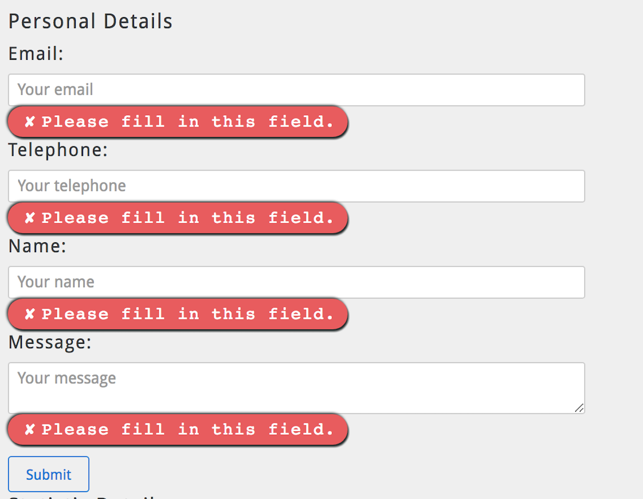
This is how your error messages will look after using this plugin.
How to use the plugin
The easiest way is to install the plugin is using npm:
npm install pretty-form-error --save
npm install jquery --save // if using jquery
If you are not using npm the easiest way is adding the files using the unpkg CDN.
<html><link rel="stylesheet" href="https://unpkg.com/pretty-form-error@check_latest_version/dist/prettyFormError.css" media="screen"><script src="https://code.jquery.com/jquery-3.1.1.js" /> <!-- Add jquery only if using it --> <script src="https://unpkg.com/pretty-form-error@check_latest_version/dist/prettyFormError.min.js" />If you don't trust CDN's, Here you can find all the compiled files. You will need to add prettyFormError.min.js, prettyFormError.min.css and jQuery on your html file.
/* plain javascript */
 prettyFormError('myFormSelector', opts);

 /* jquery example */
$('myFormSelector').prettyFormError(opts);{
multiCheckbox: {
enabled: false
},
classError: 'prettyFormError',
positionMethod: 'after',
elementError: 'div',
callToAction: 'button',
focusErrorOnClick: true,
fadeOutError: {
fadeOut: false
}
}Options
multiCheckbox[Object]
Use this option if you need to validate a group of checkboxes.disabled by default!!
{
  multiCheckbox: {
    enabled: true,
    selector: '.commonClassForGroup'
  }
}
<input required class="commonClassForGroup" type="checkbox" value="pineapple"><input required class="commonClassForGroup" type="checkbox" value="ham"><input required class="commonClassForGroup" type="checkbox" value="olives">classError[String]
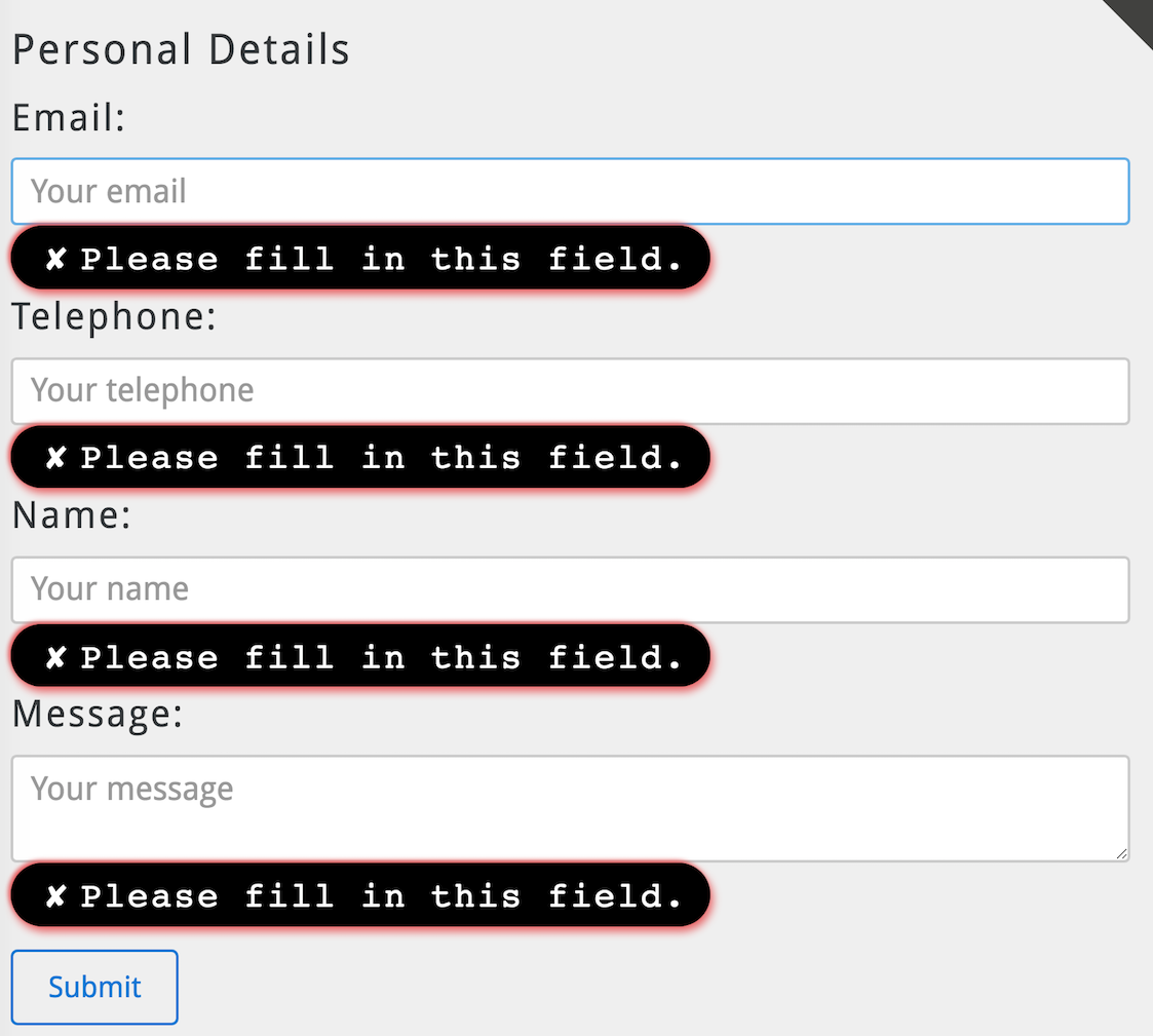
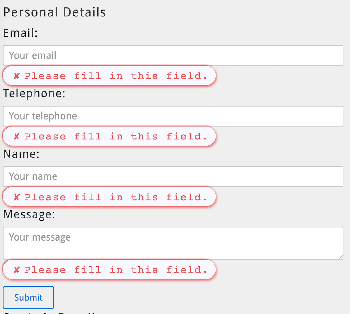
Name for the css class used for the error messages. The default one is prettyFormError but you could also use prettyFormError-black or prettyFormError-white
positionMethod[String]
Where do you want to display the error, after or before the errored input.
elementError[String]
HTML element that you want to use to wrap the errors.
callToAction[String]
HTML selector used to submit the form.
focusErrorOnClick[Boolean]
Use false if you want to disable this otpion.
fadeOutError[Number]
By default the error message will persist on the screen, if you want to fadeout the error enable this option.
timer accepts a number that would be the miliseconds passed to a setTimeout
{
  fadeOutError: {
    fadeOut: true,
    timer: [Number]
  }
}